Appearance (light & dark)
What this is
Built-in light and dark themes (Raspberry Pi red / green accents), shared ops-hero layout chrome, and theme-aware brand marks. There is no operator custom logo or colour branding in current releases — that is a far-horizon idea only.
Why it exists
Operators work in bright workshops and dark server rooms. Theme is a local browser preference, not a fleet setting, so one instance can look right for everyone without admin policy.
How to switch
| Where | Action |
|---|---|
| Header / avatar menu | Toggle theme |
| First visit | Follows system preference when possible |
Your choice is stored in the browser (local preference). It does not change other operators’ views.
Light vs dark structure
Both themes use the same layout; contrast is token-driven. Stylesheets (loaded from base.html, query-busted):
| File | Role |
|---|---|
app/static/css/themes.css | Colour tokens, header/nav, cards, buttons, shared chrome |
app/static/css/fabric.css | Network mesh SVG, focus, map fullscreen, dashboard hero |
app/static/css/fabric-stack.css | Runtime stack drawer + reorder chrome |
app/static/css/dns-hub.css | DNS records modal rows |
app/static/css/ops.css | Ops heroes, compact filters, catalog tab bar, ph-only-* responsive utilities |
app/static/css/ops-auth.css | Login / register / force-password / 2FA stage |
app/static/css/ops-pages.css | Feature pages, Docker/Services heroes, dense lists (ph-dense-*) |
| Role | Light | Dark |
|---|---|---|
Page canvas (--color-bg) | Cool grey so white cards separate | Deep navy |
Cards / panels (--color-surface) | White + border + light elevation | Elevated grey + border |
borders / chrome (--color-border) | Medium grey (readable on white) | Mid-grey on dark panels |
| Secondary buttons | Canvas-tinted fill + border (not ghost-white) | Recessed panel + border |
If light mode ever looks like “one flat white screen”, borders or canvas grey have slipped too close to pure white — fix tokens, not per-page CSS.
Brand logos (light & dark)
The product mark and About wordmark use theme-aware PNGs (no operator custom branding):
| Asset | Light UI | Dark UI |
|---|---|---|
| Header / login mark | Full-colour herder mark (piherder-mark*.png) | Black body/circuits recolored light (piherder-mark-dark*.png); red/green/brown kept |
| About / docs hero | Same mark (piherder-about.png) | Dark-theme ink treatment (piherder-about-dark.png) |
| Favicon / PWA | favicon.png + icons/icon-*.png from the same master | — |
Toggle theme swaps the image src in the browser. Asset inventory: app/static/images/README.md (mirrored under wiki/assets/ for this site).
Live docs URL (custom domain only): piherder-docs.hacknow.info. Example hostnames in guides use *.example.com.
About & updates
Avatar menu → About shows the project story, wordmark (theme-aware), running version, and links to GitHub / docs / releases. If a newer GitHub release is available, a dismissible banner appears under the header (per browser). Check for updates on the About page forces a refresh (wait modal). Disable checks with PIHERDER_UPDATE_CHECK=false (air-gapped).
Ops-hero UI (v0.5.0)
Fleet ops pages share a compact ops-hero: primary orb + dual-line stats + optional type chips. Used on:
| Area | Pages |
|---|---|
| Fleet | Servers, Jobs, Audit, Notifications (bell), fleet Services |
| Catalog | Integrations / Certificates / Templates / Network |
| Host | Server detail, host Docker, Backups, host Services |
| Access | Settings, Account, Users |
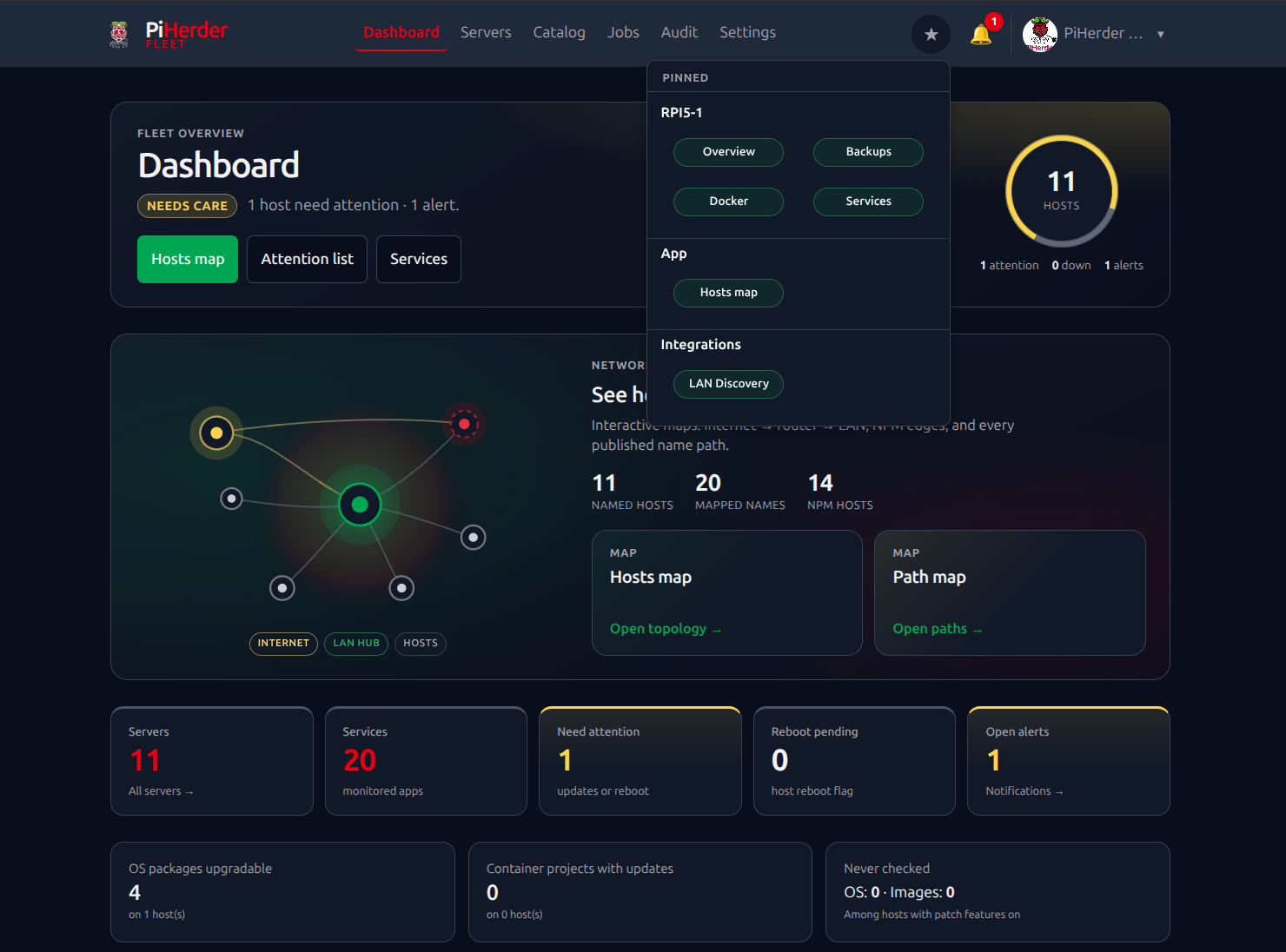
Dashboard keeps a distinct showcase hero plus a Network maps entry panel (constellation mesh). Login / register use a related mesh treatment (not the ops pulse).
Layout contract (all ops-heroes + dashboard hero):
| Viewport | Layout |
|---|---|
| < 768px | Title / actions first · compact pulse strip under it |
| ≥ 768px | Title left · pulse / viz right (fixed grid column) |
Heroes and body cards use the full main content width (Account is not clamped narrower than Servers/Jobs). Catalog always draws the viz shell (placeholder if a detail page has no stats) so switching Integrations → Certificates → Templates → Network does not jump chrome height.
Supporting chrome: compact filters (ph-subhead), branded detail modals (ph-detail-modal), mobile service rows that stack actions instead of squashing.
Mobile navigation
- Desktop and mobile menus share one
nav_items/secondary_itemssource inbase.html(no drift). - The hamburger slide-out is portaled to
bodyso fixed positioning is not trapped by page overflow (especially Network maps). - Z-index contract: map fullscreen
100000· menu backdrop100090· menu panel100100. Opening ☰ exits map fullscreen cleanly (label, aria, and viewport listeners). - Portrait ↔ landscape: the app recomputes
--app-vh/--app-vw, closes the drawer if open, and forces a short reflow so pages rescale without navigating away. Network maps also callPiHerderFabric.refreshLayout(reset map zoom, clear sticky sizes).
Theme CSS not updating after a deploy
PiHerder registers a service worker (PWA / push). Older builds cache-first’d CSS, so the browser could keep serving stale tokens until the SW cache was replaced.
Current behaviour: CSS/JS is network-first; shell cache is versioned (piherder-shell-v3+). Stylesheet links are query-busted (themes.css?v=…, fabric.css?v=…, ops.css?v=…).
If a tab still looks unchanged after a theme fix:
- Hard reload once (or close all PiHerder tabs and reopen).
- Or DevTools → Application → Service Workers → Unregister, then reload.
- Or Application → Cache Storage → delete
piherder-shell-*.
What theme does not affect
- Server data, jobs, or audits
- Self-backup / restore
- API tokens or REST behaviour
Related
- PWA & Web Push — install to home screen (theme still toggles in-app)
- Network maps — map chrome and mobile list-first
- Theme sandbox (developers):
/static/theme-test.htmlon a running instance